
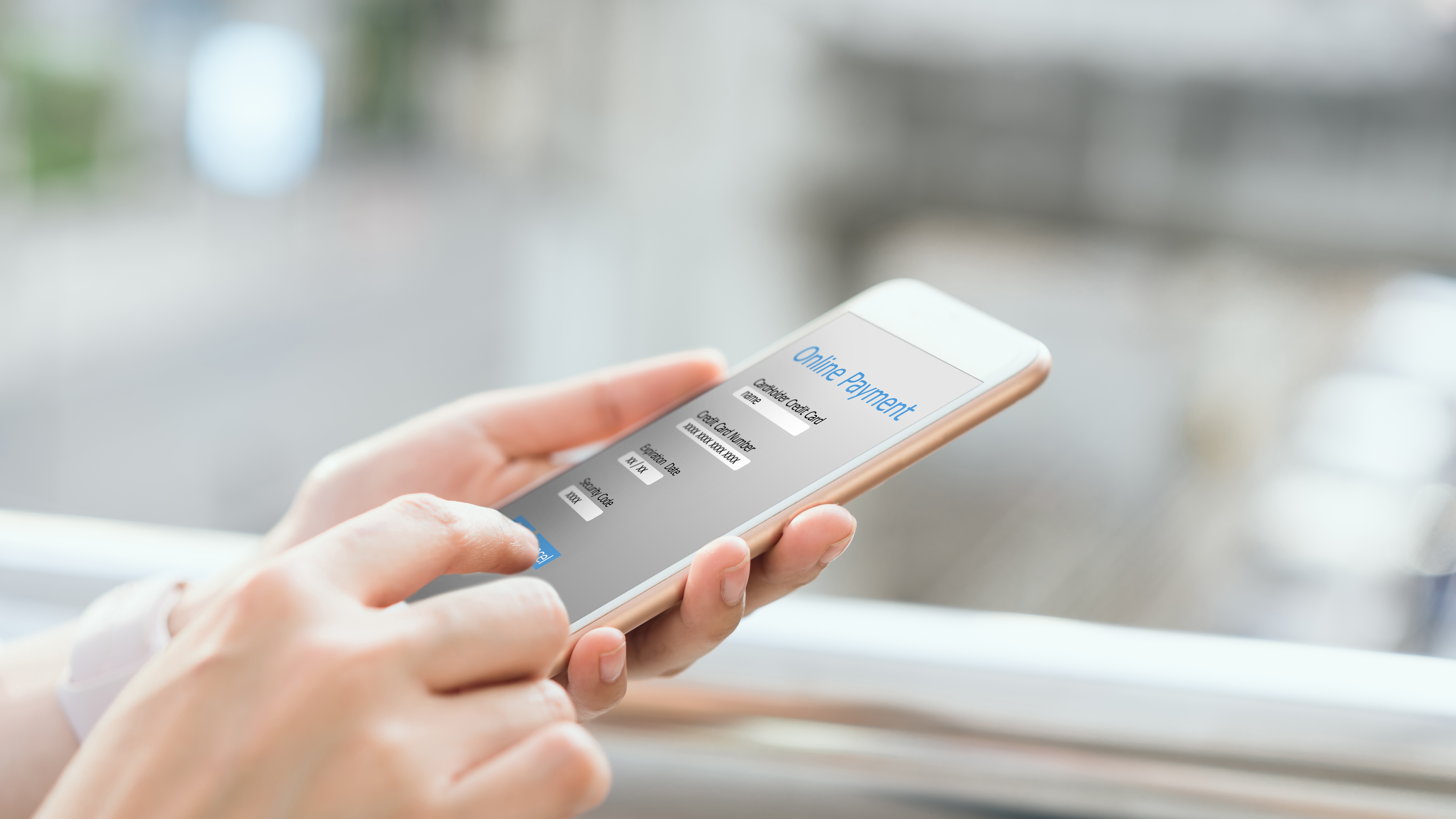
Customers don’t abandon checkout because they suddenly changed their minds. More often, they leave because the payment experience creates friction at the exact moment, they’re ready to buy.
Even today, checkout abandonment remains one of the biggest conversion leaks in e-commerce, with nearly 70% of purchases ending up abandoned. The difference between a high-performing checkout and an average one often comes down to speed, trust, and simplicity.
The modern checkout standard
Today’s shoppers expect payments to feel invisible.
That means:
- no redirects
- no forced registration
- no unnecessary forms
- no surprises at the final step
A modern payment page should work across all devices, support preferred local payment methods, and help customers complete purchases in seconds – not minutes.
-
Reduce friction wherever possible
Every extra field, click, or loading step increases the chance of customers leaving.
High-converting checkouts are designed to remove hesitation:
- avoid redirects
- autofill wherever possible
- support express checkout options
- let returning customers pay in one click
Embedded and pop-up payment flows are becoming increasingly popular because they help customers stay focused without leaving the merchant environment.
-
Offer the payment methods customers already trust
Payment preferences are local.
Some customers want cards. Others expect Apple Pay, Google Pay, instant bank transfers, or local payment methods they already use every day.
The fastest way to increase checkout confidence is to give customers options at the moment they’re ready to pay.
Merchants that localize payment methods typically see stronger authorization rates and better conversion performance across markets.
-
Build trust into the checkout experience
Trust is one of the biggest conversion drivers at payment stage.
Customers need immediate reassurance that:
- their payment is secure
- pricing is transparent
- the process is legitimate
- their preferred payment method is supported
Simple improvements can make a major difference:
- display security and compliance indicators
- clearly show shipping costs before checkout
- maintain consistent branding
- avoid unexpected redirects or visual changes
A payment page should feel like a natural extension of the merchant’s brand – not a disconnected third-party flow.
-
Design for mobile-first behavior
Mobile commerce now dominates large parts of online retail, but many payment experiences are still built like desktop forms squeezed onto smaller screens.
Modern mobile checkouts prioritize:
- thumb-friendly layouts
- digital wallets
- fast authentication
- fewer input fields
- optimized loading speeds
The best mobile payment experiences reduce the process to just a few taps.
-
Treat payments as part of your growth strategy
Payments are no longer just infrastructure.
They directly influence:
- conversion rates
- customer retention
- international expansion
- subscription performance
- fraud management
The strongest payment experiences combine flexibility, localization, security, and speed – all while staying nearly invisible to the customer.
Because when checkout feels effortless, customers are far more likely to complete the purchase.
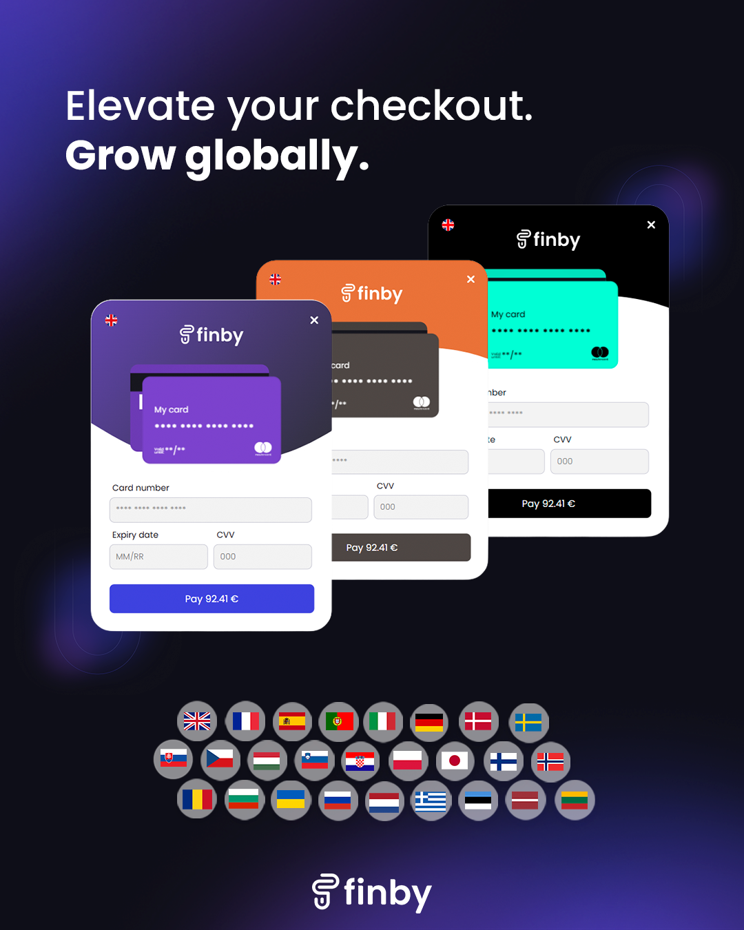
Our checkout solution
At Finby, we help businesses create faster, more seamless checkout experiences. Our solution gives businesses multiple integration options, including:
- embedded payment fields
- pop-up payment flows
- hosted express checkout
This flexibility allows merchants to create payment experiences that match their product and customer journey.
Embedded checkout experiences are especially valuable because customers stay within the merchant environment throughout the payment process. Instead of being redirected to an unfamiliar external page, the experience remains consistent and branded.
That consistency helps improve trust and reduce abandonment
Personalize your checkout
Businesses can customize the checkout experience to match their brand, including colors, logos, and overall styling. A familiar and consistent design helps customers feel more confident when completing a payment. We have also added language options to our Finby’s checkout experience which supports 26 languages, helping businesses create more localized and user-friendly payment experiences across international markets.
Checkout is no longer just the final step of a transaction – it’s part of the customer experience itself.
Businesses that invest in faster, more localized, and frictionless payment flows are better positioned to improve conversion, build trust, and grow internationally.
At finby, we’re focused on helping merchants create payment experiences that feel seamless from the first click to the final confirmation.
Wish to find out more about how to make your checkout more welcoming to the customers? Contact us via e-mail at sales@finby.eu.